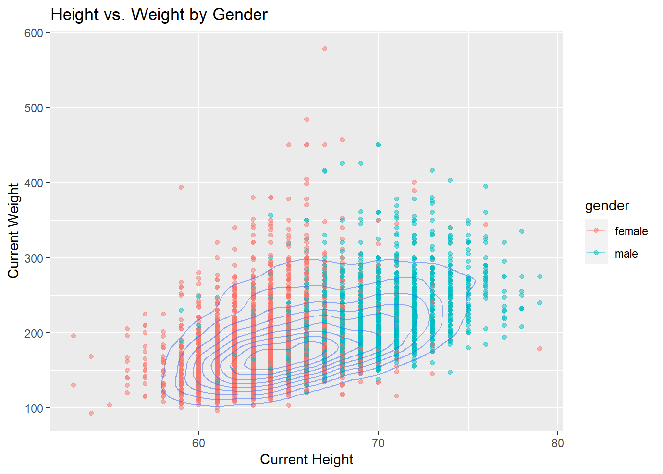
3.1 Scatterplot with Contour Line - Height vs. Weight by Gender
We utilize a scatter plot with contour lines to view the fundamental characteristics of heights and weights categorized by gender. Prior to creating the plot, extreme values of weights and heights were identified and removed to mitigate the potential influence of outliers on the overall patterns. The comprehensive plot, encompassing all genders, reveals a positive correlation between height and weight. This correlation aligns with our intuitive understanding: as height increases, so does weight.
The density contour lines play a crucial role in illustrating regions of heightened data point concentration. A prominent cluster dominates the plot, indicating that heights tend to concentrate between 60 and 70 inches, while weights concentrate between 100 and 250 pounds. Noteworthy outliers are present on the plot, with a particularly intriguing observation: the majority of outliers are females with heavier weights.
As we delve deeper into our exploration of health metrics, we turn our attention to Body Mass Index (BMI), a widely used measure that provides insights into the relationship between an individual’s weight and height. BMI is a numerical value calculated by dividing an individual’s weight in pounds by the square of their height in inches. We use the BMI formula given by CDC to calculate each person’s previous and current BMI:
\[
\frac{Weight(lb)}{height(in)^2} \cdot 703
\]
We utilize the following BMI categories ranging from underweight to obese in the chart below:
BMI
Weight Status
Below 18.5
Underweight
18.5 - 24.99
Healthy Weight
25.0 - 29.99
Overweight
30.0 and above
Obesity
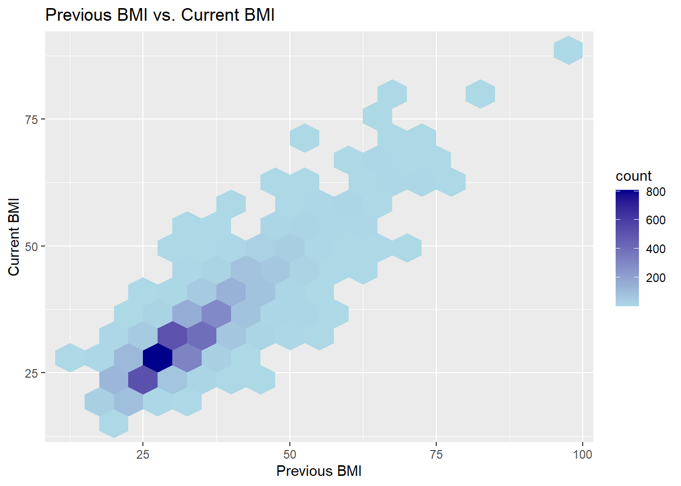
3.3 Heatmap - Previous BMI vs. Current BMI
Based on the BMI we calculated, we use a heatmap to take a look at the overall counts for both previous BMI and current BMI. The diagonal trend observed from the bottom left to the top right suggests that many individuals have remained within a similar BMI category. The lighter squares along the diagonal implies a consistency in BMI over time for a substantial number of participants. However, there are also some lighter squares off the diagonal, indicating that there have been changes in BMI for some individuals either towards the higher or lower end. The heatmap also shows a concentrated cluster of values within the BMI range of 20 to 30.
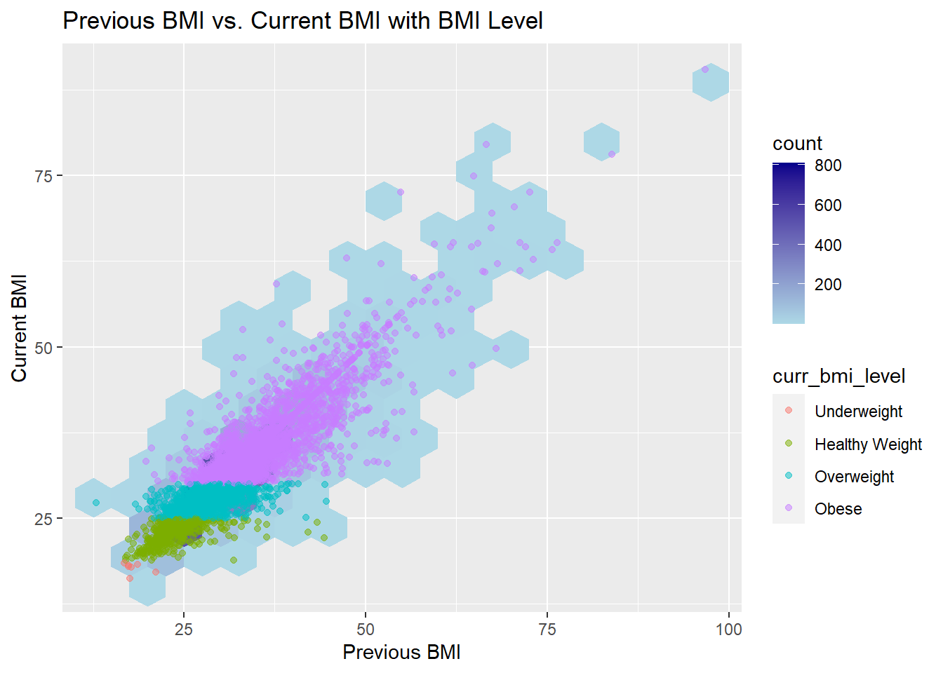
To better take a look at the current BMI level of each clusters, we add overlaid points onto the heatmap, color-coded based on the current BMI level. The resulting visualization vividly illustrates that the majority of individuals within this BMI range are classified as overweight, and there do has a large amount of people are classified as health weight and obese.
Code
ggplot(whq1, aes(prev_bmi, curr_bmi)) +geom_hex(binwidth =c(5, 5)) +scale_fill_gradient(low ="lightblue", high ="darkblue") +labs(title ="Previous BMI vs. Current BMI",x ="Previous BMI",y ="Current BMI")
Code
ggplot(whq1, aes(prev_bmi, curr_bmi)) +geom_hex(binwidth =c(5, 5)) +scale_fill_gradient(low ="lightblue", high ="darkblue") +geom_point(aes(color = curr_bmi_level), alpha =0.5) +labs(title ="Previous BMI vs. Current BMI with BMI Level",x ="Previous BMI",y ="Current BMI")
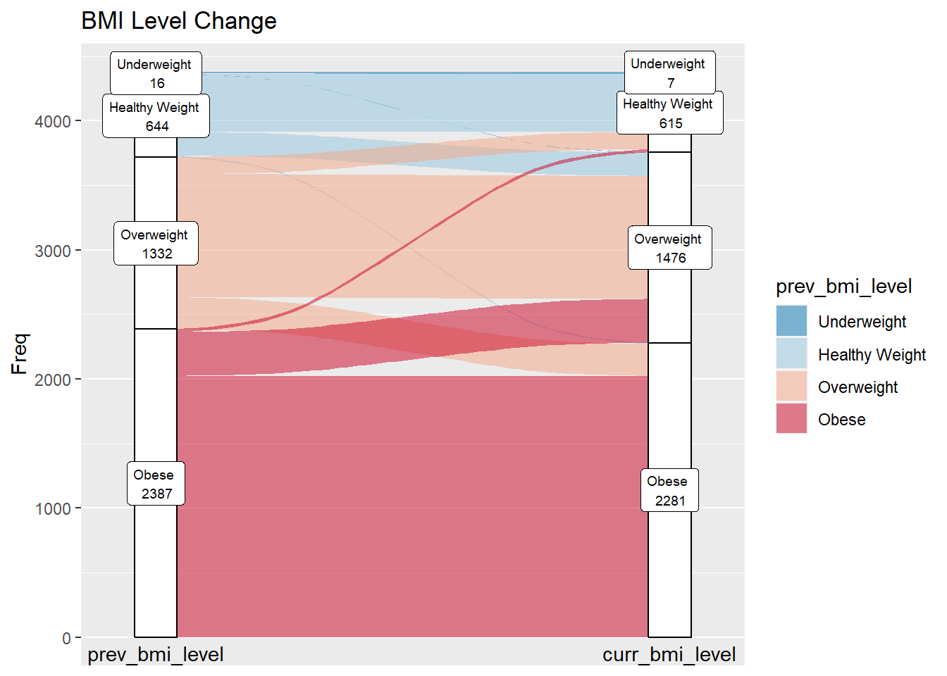
3.4 Alluvial - BMI Level Change
To see the dynamics of BMI level changes over time, we employed an alluvial plot to see the transitions between different BMI categories from the previous year to the current year. As the graph shows, a substantial amount of individuals have maintained a consistent BMI level, with a notable concentration in obese category.
In instances of BMI level changes, the most prominent transition is observed in individuals moving from the obese level to overweight. A smaller yet noteworthy group has significant weight loss, transitioning from obese to healthy weight. And there also have some individuals transition from overweight to a healthy weight, reflecting positive changes in lifestyle and weight management strategies. Conversely, there are instances where individuals have moved from healthier BMI level to overweight or obese.
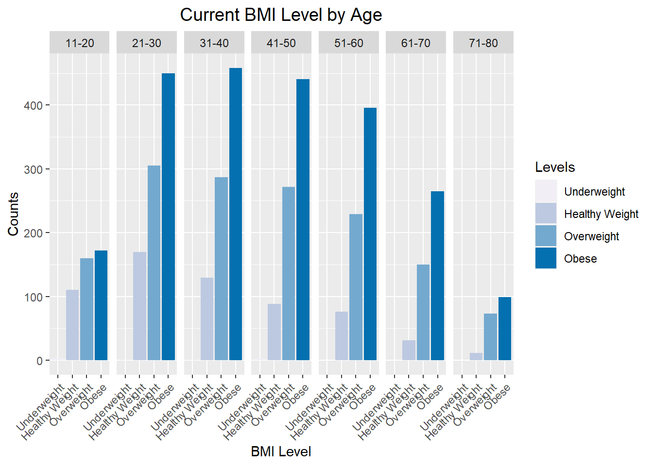
In our exploration of the interplay between age and BMI, we crafted a grouped bar chart to show the distribution of current BMI across distinct age groups. The chart shows a prevalence of ‘Overweight’ and ‘Obese’ categories across all age groups, indicated by the taller bars in these categories. Conversely, the ‘Healthy Weight’ category appears to have fewer individuals, particularly in the middle age ranges. An interesting balance is noted in the BMI levels for teenagers in the 11-20 age groups, with a distribution that appears more evenly spread among different categories.
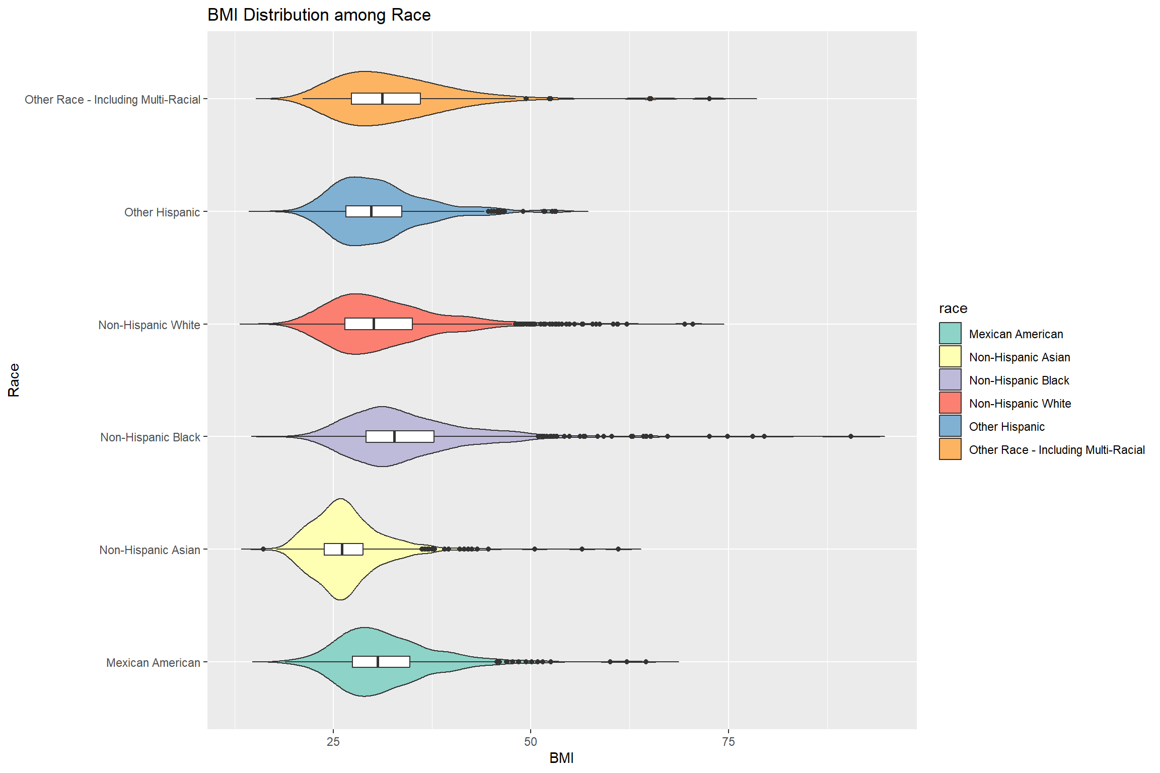
We use a violin plot to provide a visual comparison of BMI distributions across the race groups. Some races, such as non-Hispanic Black and other Race, show a wider distribution of BMI, indicating more variability within these groups. Conversely, others groups have a narrower distribution, suggesting more uniform BMI values.
The median BMI values vary by group, with non-Hispanic Black shows a higher median and non-Hispanic Asian shows a comparatively smaller median. Additionally, the plot reveals a prevalent right skewed trend with longer tail towards higher BMI values in most groups. Notably, Non-Hispanic Asian is more closely resembling normality, showcasing a balanced and symmetric BMI profile. The existence of outliers within each group further emphasizes the diversity of BMI values.
Code
ggplot(whq, aes(x = curr_bmi, y = race, fill = race)) +geom_violin(trim=FALSE) +geom_boxplot(width=0.1, fill="white") +labs(title="BMI Distribution among Race",x="BMI", y ="Race") +scale_fill_brewer(palette="Set3")
3.7 Pyramid Chart - Age Distribution of the Heaviest Weight by Gender
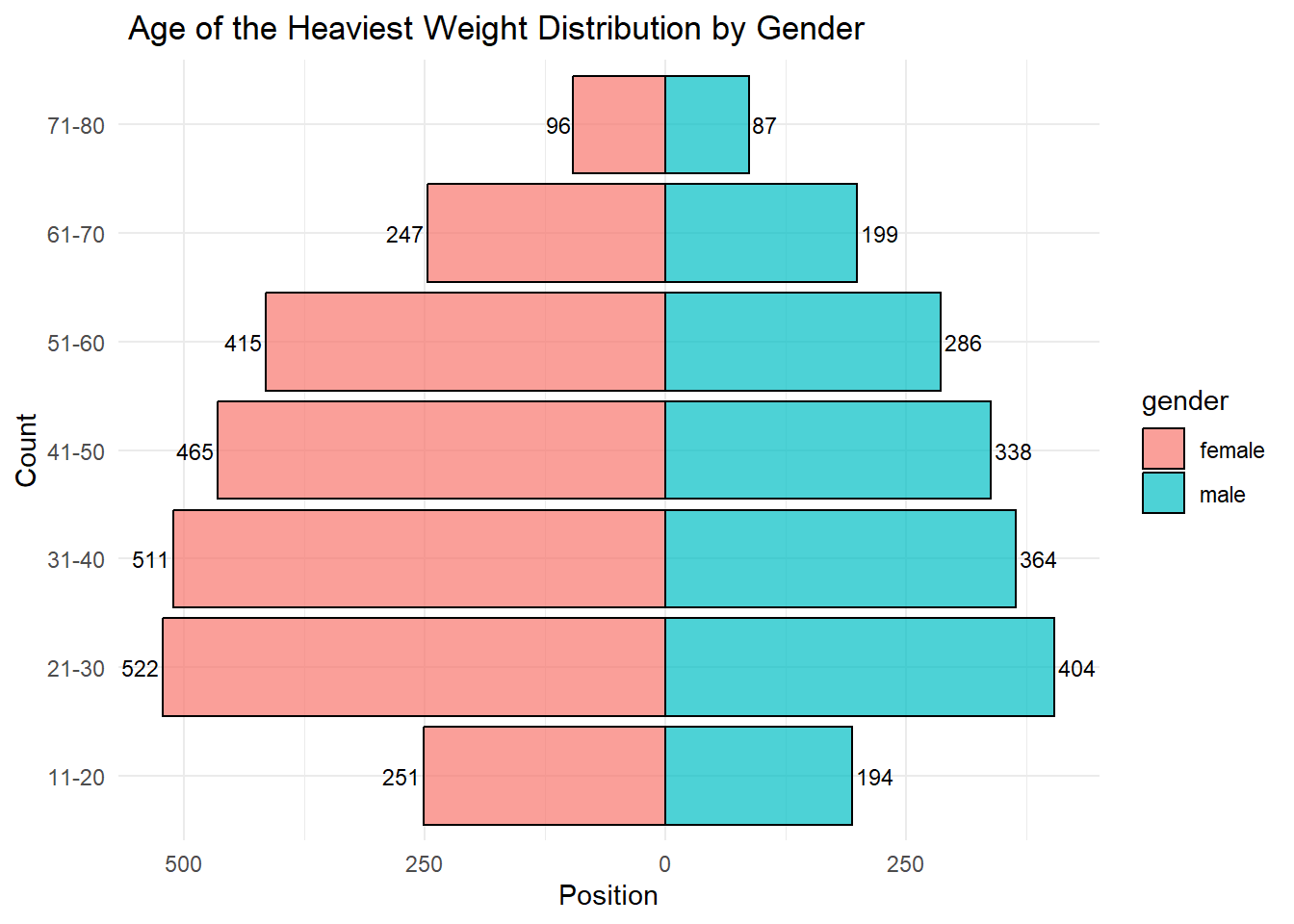
This chart counts the age of heaviest weight by gender and segmented into distinct age groups, showing some noteworthy patterns in weight reporting trends. For most age groups, females reported their heaviest weight in higher numbers compared to males. But in our dataset, the total number of male and female are different. The age groups of 21-30 and 31-40 stand out with the highest counts of reported heaviest weight for both genders. This suggests that these age ranges are critical periods where individuals are most likely to gain a heaviest weight. The counts generally decrease for both genders as age increases, particularly beyond the age of 60.
Code
whq$age_group <-cut(whq$age_heaviest_weight,breaks =c(10, 20, 30, 40, 50, 60, 70, 80),labels =c("11-20", "21-30", "31-40", "41-50", "51-60", "61-70", "71-80"),include.lowest =TRUE)plot_data <- whq %>%group_by(age_group, gender) %>%summarise(count =n()) %>%ungroup()plot_data$count[plot_data$gender =="female"] <--plot_data$count[plot_data$gender =="female"]ggplot(plot_data, aes(x = count, y = age_group, fill = gender)) +geom_bar(stat ="identity", position ="identity", color ="black", alpha =0.7) +geom_text(aes(label =abs(count), hjust =ifelse(count <0, 1.1, -0.1)), color ="black", size =3) +labs(title =" Age of the Heaviest Weight Distribution by Gender",x ="Position",y ="Count") +scale_x_continuous(labels = abs) +theme_minimal()
3.8 Correlation Analysis Between Factors and BMI Change
3.8.1 Radar Chart - Weight Loss Intentions & Behavior by Loss Weight Methods
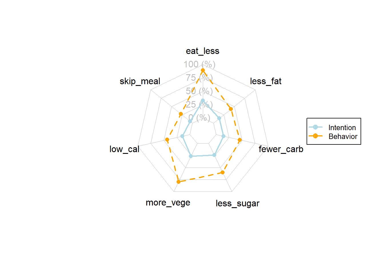
The radar chart provides a multi-faceted into the dietary intention and behaviors of individuals across various factors. The axes radiating from the center represent different dietary factors including ‘eat less,’ ‘less fat,’ ‘fewer carbs,’ ‘less sugar,’ ‘more vegetables,’ ‘low calories,’ and ‘skipping meals’. Each axis is scored from 0 to 100%, indicating the percentage of individuals who either intend to or actually engage in the behavior associated with each factor.
The chart shows that for most dietary factors, the intention to engage in a specific behavior is higher than the actual behavior itself. Less than half of the people who have intention to lose weight actually behavior on it. The greatest discrepancy between intention and behavior appears in ‘eat less’ and ‘more vege’. And more people behavior on lossing weight by ‘eat less’, ‘more vege’, and ‘less suger’
The mosaic plot is divided into sections that represent combinations of whether individuals engage in dieting behaviors: eat less, low calories, skip meal. Different shades indicating BMI change on whether the dieting behavior works are separated to three results: ‘lose’, ‘maintain’, or ‘gain’.
The size of each section represents the proportion of individuals within each category of dieting behavior and BMI change. For individuals who do eat less (eat_less = TRUE), there appears to be a greater proportion of weight loss, particularly among those who also engage in a low-calorie diet. From the graph, we can conclude that the top three combinations to lose weight are:
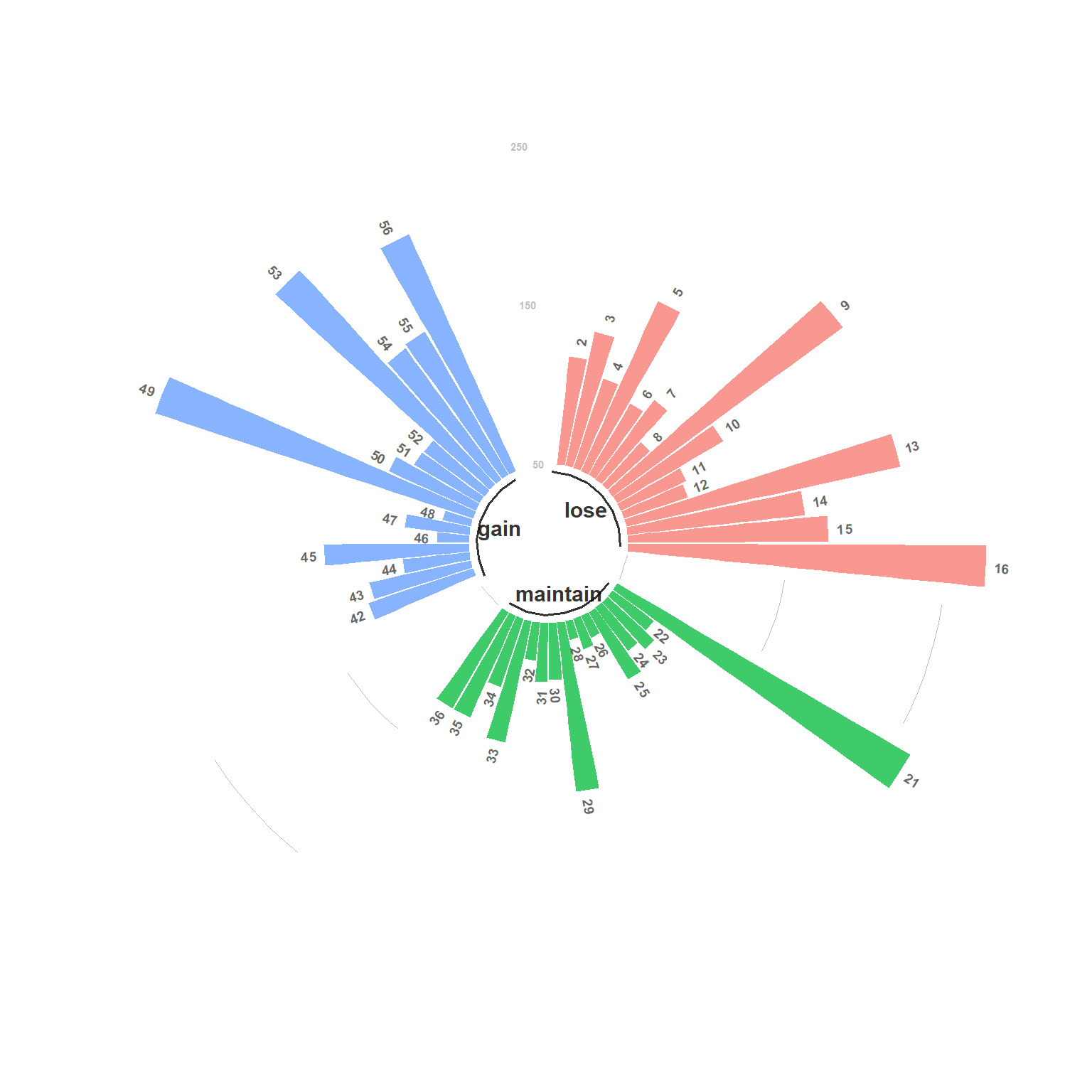
The chart is divided into three sectors, each representing a category of weight change: ‘gain’, ‘maintain’, and ‘lose’. Each sector contains radial bars whose lengths are proportional to a specific value, which appears to be associated with different dietary preferences or factors. The ‘gain’ sector is in blue, ‘maintain’ in green, and ‘lose’ in red, each with numbered labels on the bars which corresponding to specific dietary preferences or behaviors as the table below:
The red ‘lose’ sector has bars of varying lengths, suggesting different levels of association between the numbered factors and weight loss. The ‘maintain’ and ‘gain’ sectors also show variability in bar lengths, which implies that certain dietary preferences are more commonly associated with maintaining or gaining weight.
In our analysis, we want to focus more on the weight loss. We can compare between the impact of various dietary factors on weight change based on the length of the bars. As a result, from the plot, we can conclude that the top three combinations to lose weight are:
id 16 - More Vegetable, Less Sugar, Fewer Carbs, Less Fat
id 13 - More Vegetable, Less Sugar
id 9 - More Vegetable
Code
library(tidyverse)library(dplyr)preference_sub_df <- whq |>group_by(bmi_level_change, more_vege, less_sugar, fewer_carb, less_fat) |>summarise(frequency =n(), .groups ='drop') |>rename("Freq"= frequency)whq_dietary <- preference_sub_dfempty_bar <-4to_add <-data.frame( matrix(NA, empty_bar*nlevels(whq_dietary$bmi_level_change), ncol(whq_dietary)) )colnames(to_add) <-colnames(whq_dietary)to_add$bmi_level_change <-rep(levels(whq_dietary$bmi_level_change), each=empty_bar)whq_dietary <-rbind(whq_dietary, to_add)whq_dietary <- whq_dietary |>arrange(bmi_level_change)whq_dietary$id <-seq(1, nrow(whq_dietary))# Get the name and the y position of each labellabel_data <- whq_dietarynumber_of_bar <-nrow(label_data)angle <-90-360* (label_data$id-0.5) /number_of_bar # I substract 0.5 because the letter must have the angle of the center of the bars. Not extreme right(1) or extreme left (0)label_data$hjust <-ifelse( angle <-90, 1, 0)label_data$angle <-ifelse(angle <-90, angle+180, angle)base_data <- whq_dietary |>group_by(bmi_level_change) |>summarize(start=min(id), end=max(id) - empty_bar) |>rowwise() |>mutate(title=mean(c(start, end)))# prepare a data frame for grid (scales)grid_data <- base_datagrid_data$end <- grid_data$end[ c( nrow(grid_data), 1:nrow(grid_data)-1)] +1grid_data$start <- grid_data$start -1grid_data <- grid_data[-1,]# Make the plotp <-ggplot(whq_dietary, aes(x=as.factor(id), y=Freq, fill=bmi_level_change)) +geom_bar(aes(x=as.factor(id), y=Freq, fill=bmi_level_change), stat="identity", alpha=0.5) +# Add a val=100/75/50/25 lines. I do it at the beginning to make sur barplots are OVER it.geom_segment(data=grid_data, aes(x = end, y =300, xend = start, yend =300), colour ="grey", alpha=1, size=0.3 , inherit.aes =FALSE ) +geom_segment(data=grid_data, aes(x = end, y =200, xend = start, yend =200), colour ="grey", alpha=1, size=0.3 , inherit.aes =FALSE ) +geom_segment(data=grid_data, aes(x = end, y =100, xend = start, yend =100), colour ="grey", alpha=1, size=0.3 , inherit.aes =FALSE ) +geom_segment(data=grid_data, aes(x = end, y =0, xend = start, yend =0), colour ="grey", alpha=1, size=0.3 , inherit.aes =FALSE ) +# Add text showing the value of each 100/75/50/25 linesannotate("text", rep(max(whq_dietary$id),4), y =c(0, 100,200, 300), label =c("50", "150", "250", "350"), color="grey", size=2 , angle=0, fontface="bold", hjust=1) +geom_bar(aes(x=as.factor(id), y=Freq, fill=bmi_level_change), stat="identity", alpha=0.5) +ylim(-50,250) +theme_minimal() +theme(legend.position ="none",axis.text =element_blank(),axis.title =element_blank(),panel.grid =element_blank(),plot.margin =unit(rep(-1,4), "cm") ) +coord_polar() +geom_text(data=label_data, aes(x=id, y=Freq+10, label=id), color="black", fontface="bold",alpha=0.6, size=2.5, angle= label_data$angle, inherit.aes =FALSE ) +# Add base line informationgeom_segment(data=base_data, aes(x = start, y =-5, xend = end, yend =-5), colour ="black", alpha=0.8, size=0.6 , inherit.aes =FALSE ) +geom_text(data=base_data, aes(x = title, y =-18, label=bmi_level_change), colour ="black", alpha=0.8, size=4, fontface="bold", inherit.aes =FALSE)p
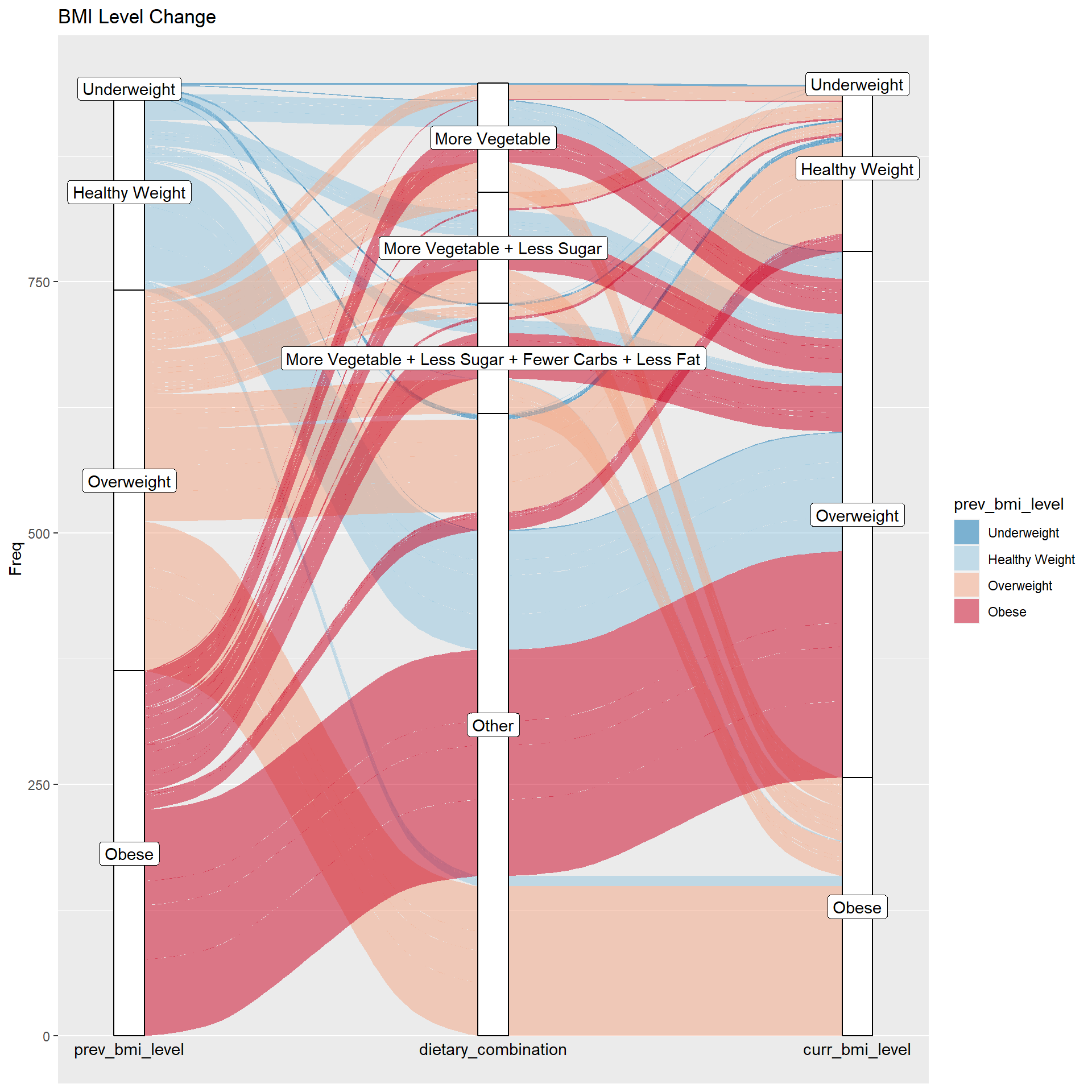
3.8.4 Alluvial - Dietary Combined Impact on BMI Level
Based on the previous analysis, we extract the combinations of id 16 (More Vegetable, Less Sugar, Fewer Carbs, Less Fat), id 13 (More Vegetable, Less Sugar) and id 9 (More Vegetable) to check their corresponding effects on BMI level. In the alluvial, we showed a BMI level change from previous year to current year by cross these combinations.
As we can see in the graph, there exists a large amount of individuals who implemented the these three combinations and loss their weight accordingly. However, there still exists some people who tried the combined dietary but didn’t work out very well.
Code
library(ggalluvial)whq_final <-read.csv("data/whq_final.csv")whq_final$prev_bmi_level <-factor(whq$prev_bmi_level, levels =c('Underweight', 'Healthy Weight', 'Overweight', 'Obese'))whq_final$curr_bmi_level <-factor(whq$curr_bmi_level,levels =c('Underweight', 'Healthy Weight', 'Overweight', 'Obese'))change_final <- whq_final |>group_by(prev_bmi_level, meal_combination, dietary_combination, curr_bmi_level) |>summarise(frequency =n(), .groups ='drop') |>rename("Freq"= frequency)# Check if the BMI level has changedchange_final$level_changed <-ifelse(change_final$prev_bmi_level != change_final$curr_bmi_level, TRUE, FALSE)# Filter out the changed levelschange_final <- change_final |>filter(level_changed ==TRUE)ggplot(change_final, aes(y = Freq, axis1 = prev_bmi_level, axis2 = dietary_combination, axis3 = curr_bmi_level)) +geom_alluvium(aes(fill = prev_bmi_level), width =1/12) +geom_stratum(width =1/12) +geom_label(stat ="stratum", aes(label =after_stat(stratum))) +scale_x_discrete(expand =c(0.05, 0.05)) +scale_fill_brewer(type ="qual", palette ="RdBu", direction =-1) +labs(title ="BMI Level Change") +annotate("text", x =1, y =0, label ="prev_bmi_level", vjust =1.5, hjust =0.5) +annotate("text", x =2, y =0, label ="dietary_combination", vjust =1.5, hjust =0.5) +annotate("text", x =3, y =0, label ="curr_bmi_level", vjust =1.5, hjust =0.5) +theme(axis.title.x =element_blank())